CONFECTIONERY ARKADIA
Brand Identity
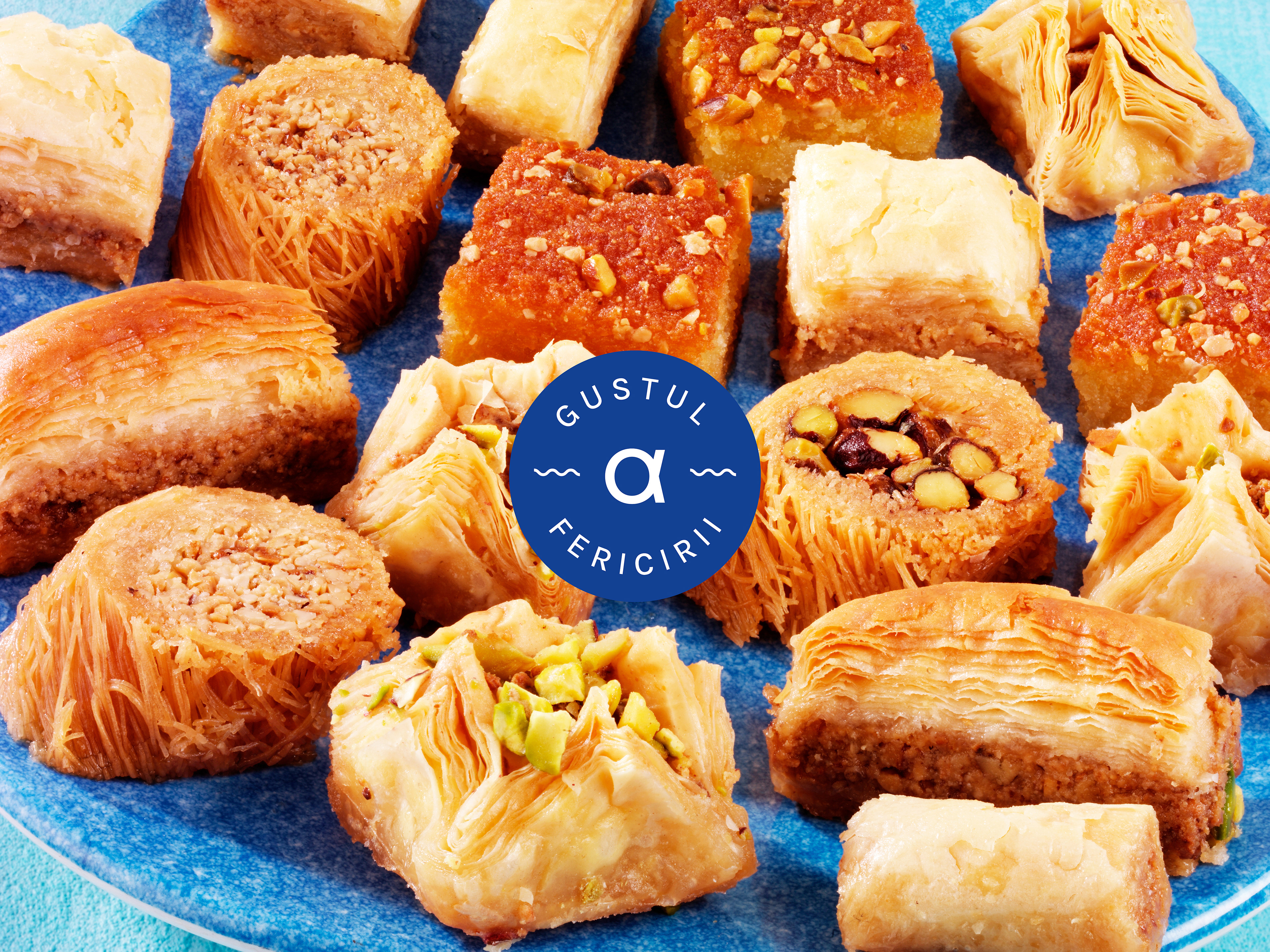
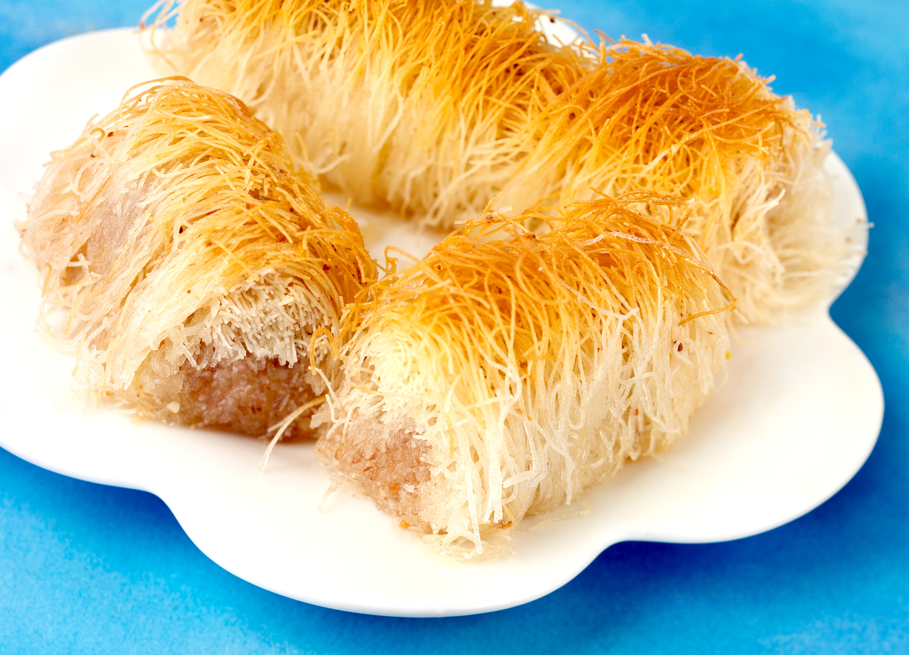
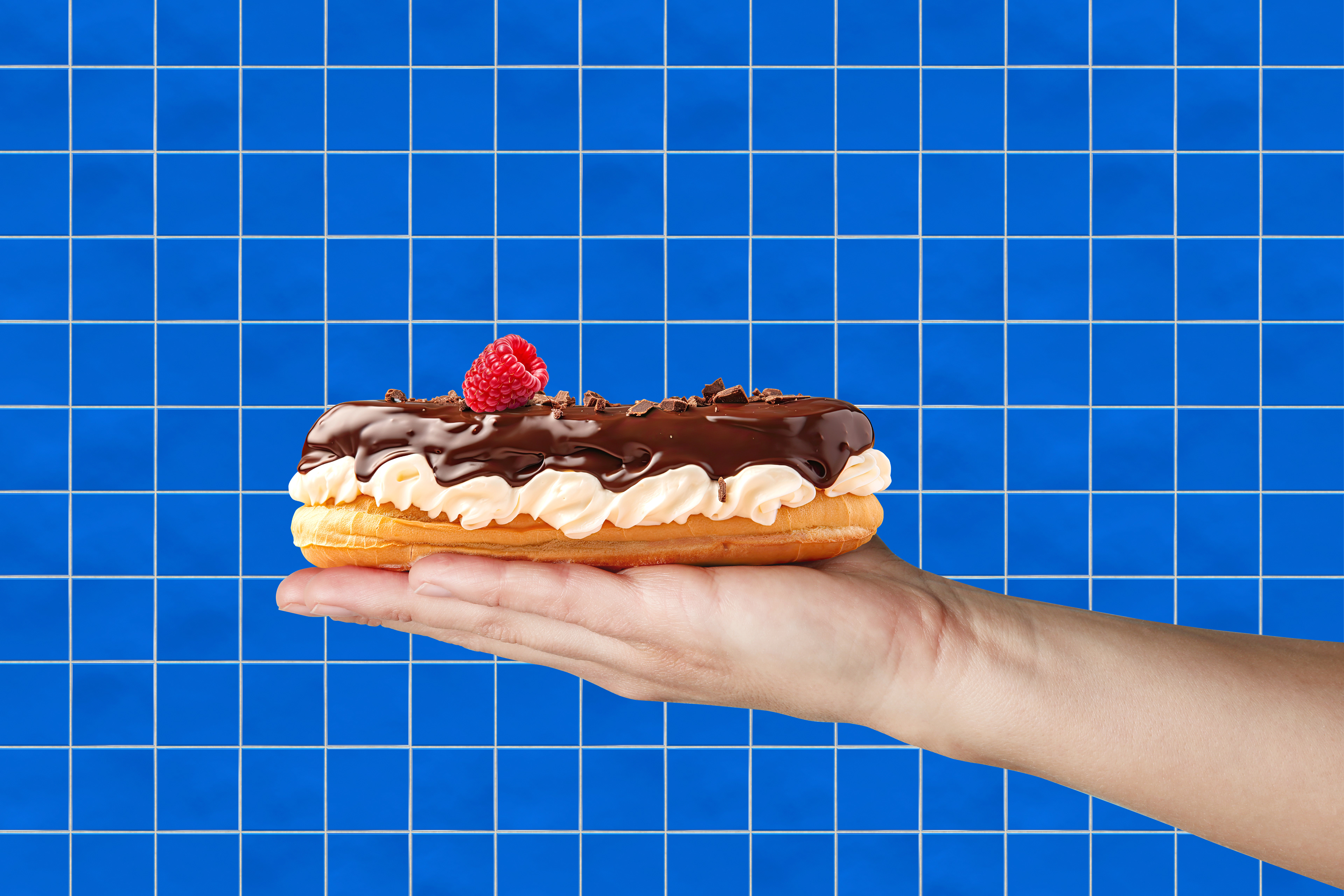
Arkadia is a local confectionery chain with a Greek soul, known for its high-quality, handmade sweets crafted from carefully selected ingredients.
Blending European and Greek recipes, Arkadia creates flavors that evoke happiness and comfort — a sense of indulgence made accessible to everyone. In every city where it operates, Arkadia is among the top choices for dessert lovers, with the ambition to become the number one confectionery brand.
Blending European and Greek recipes, Arkadia creates flavors that evoke happiness and comfort — a sense of indulgence made accessible to everyone. In every city where it operates, Arkadia is among the top choices for dessert lovers, with the ambition to become the number one confectionery brand.
CONCEPT
The brand draws inspiration from the Greek region of Arcadia — a mythical land of harmony and happiness.
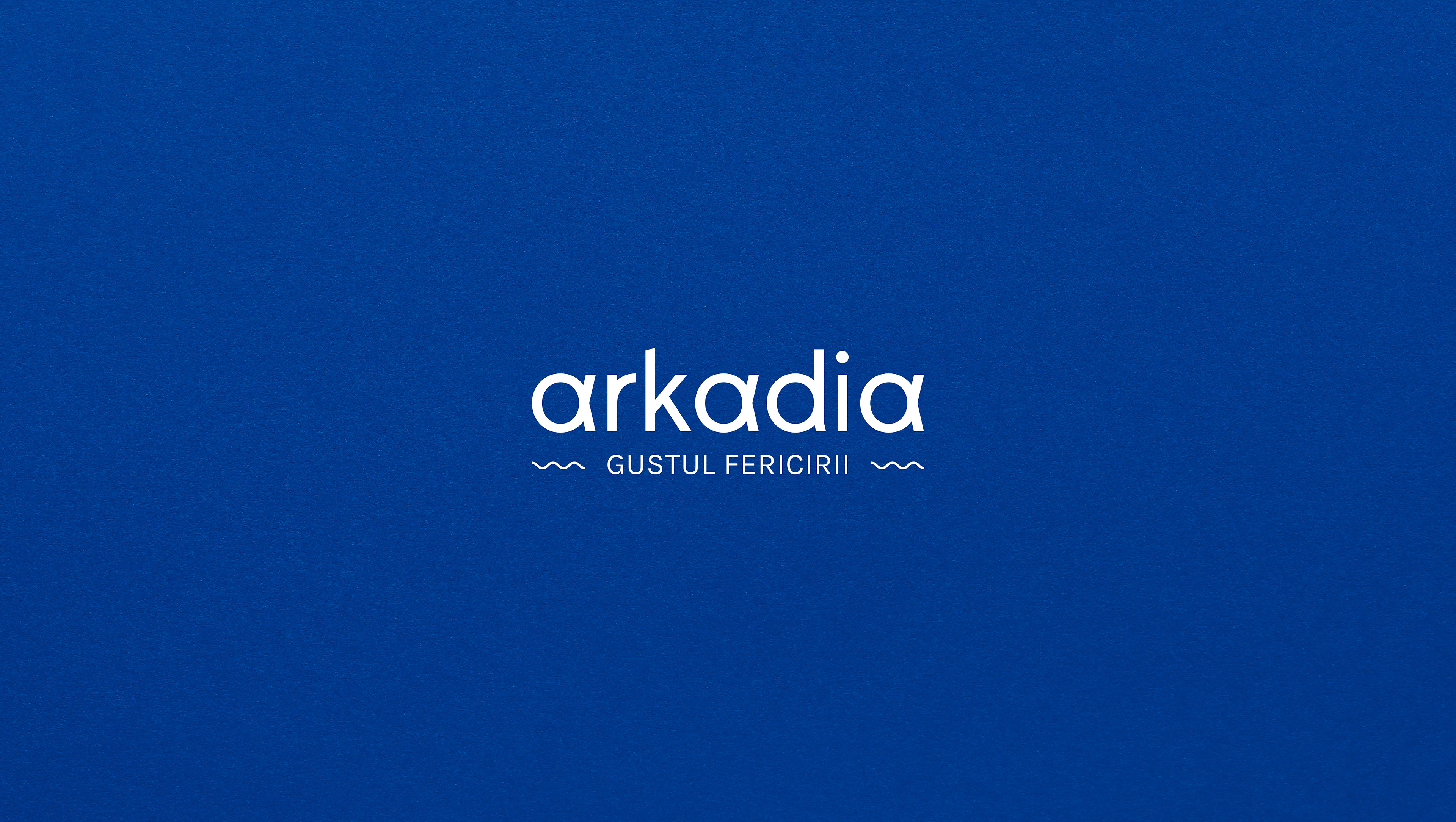
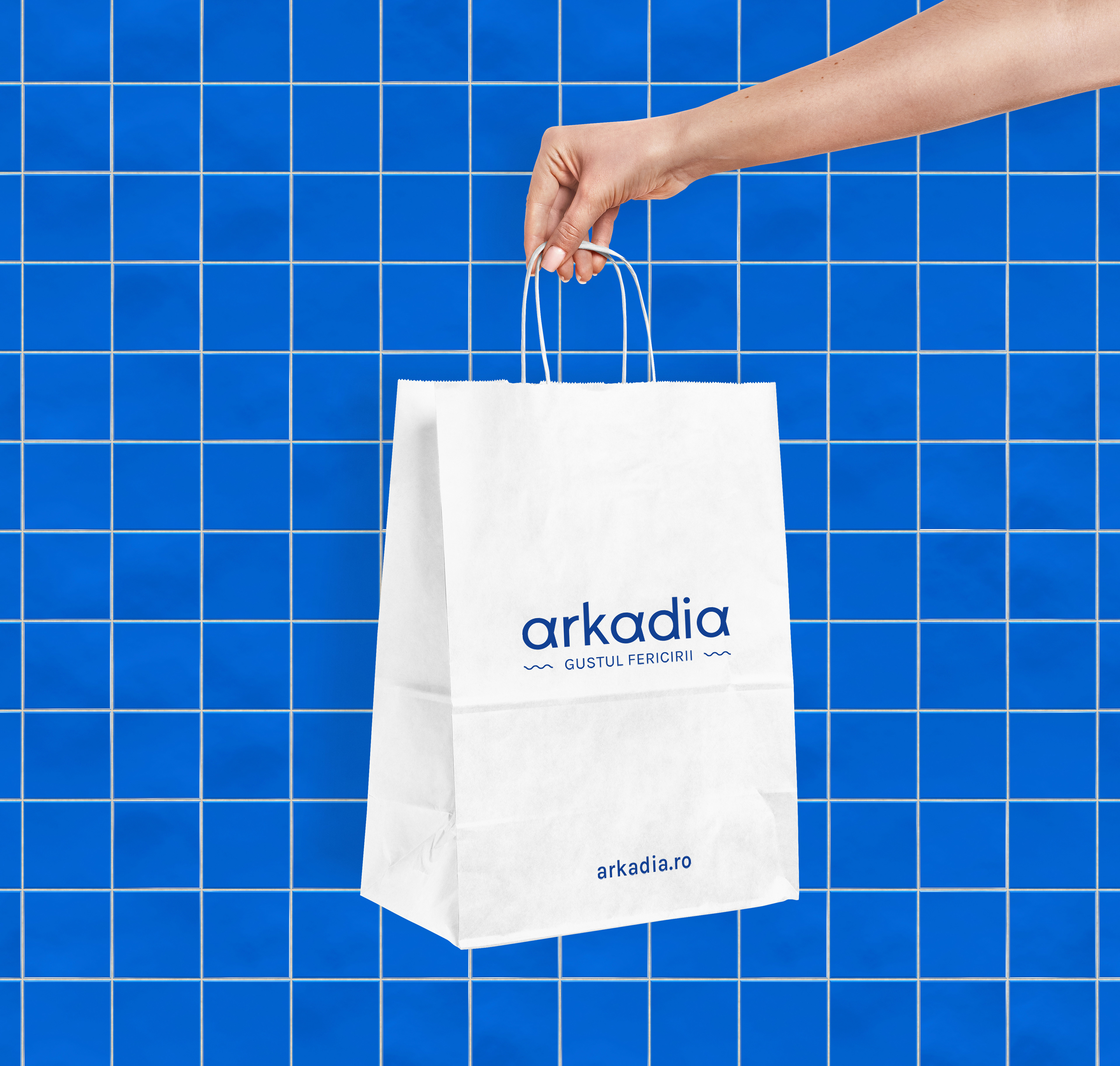
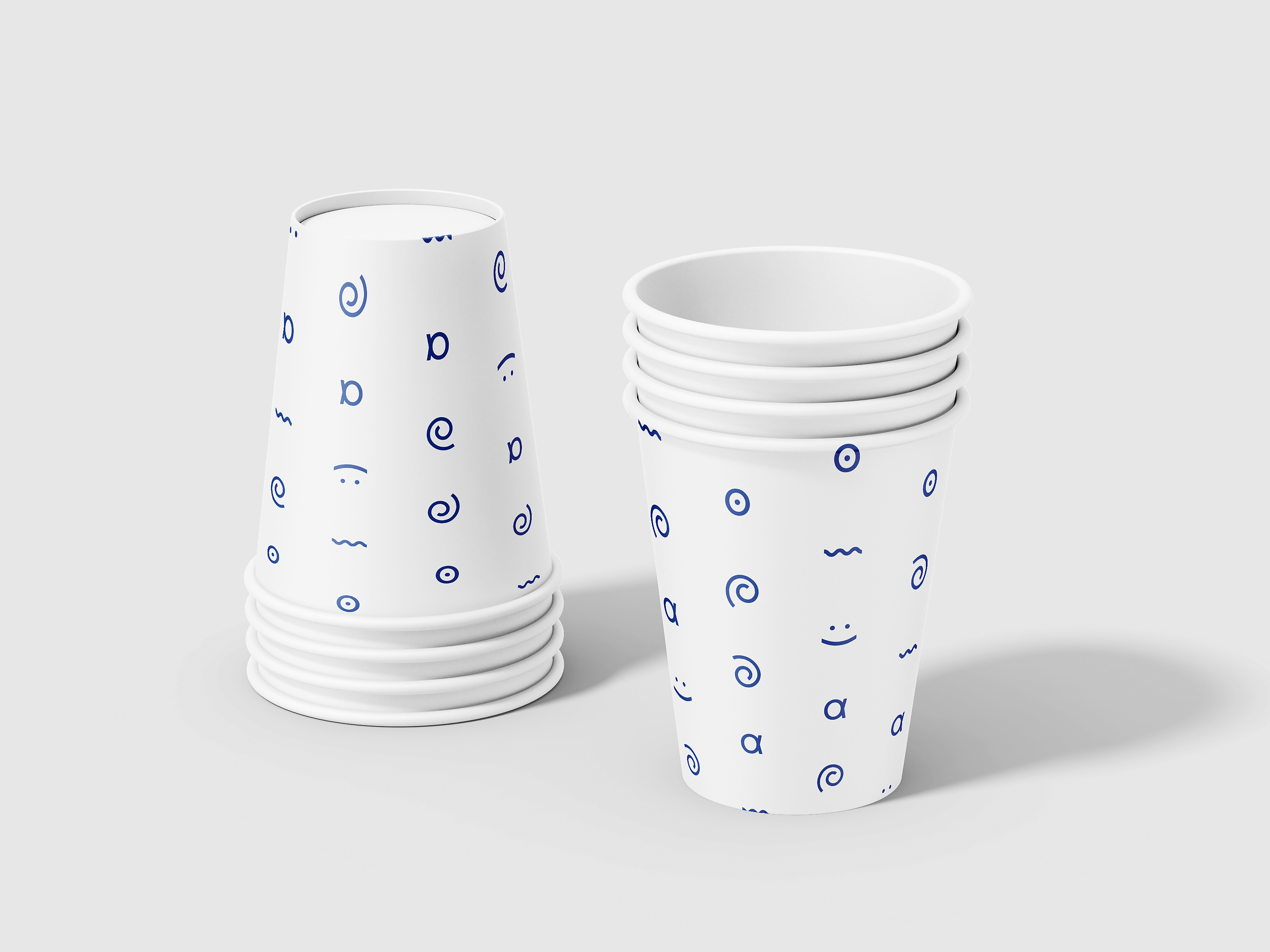
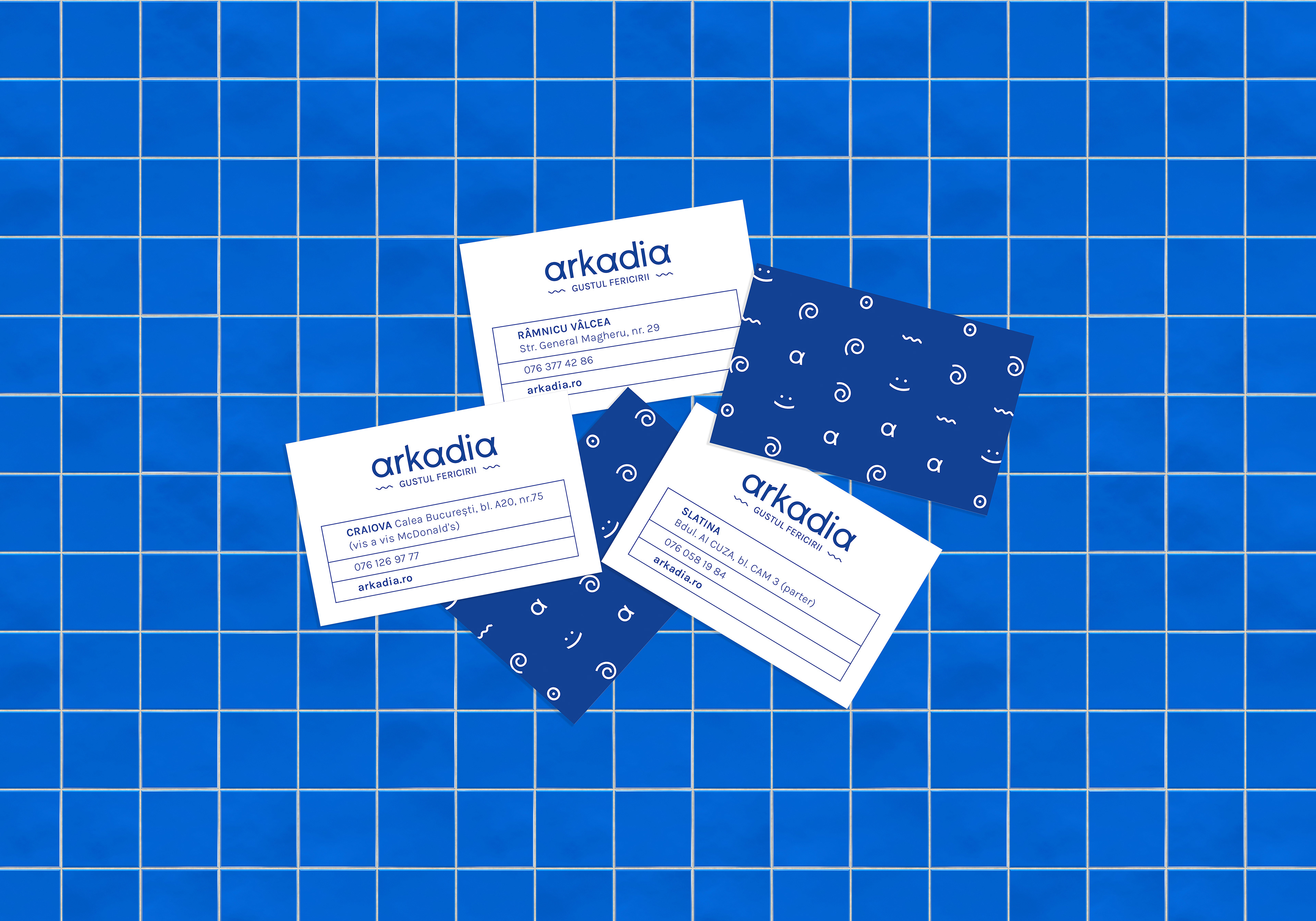
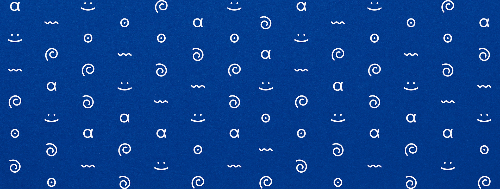
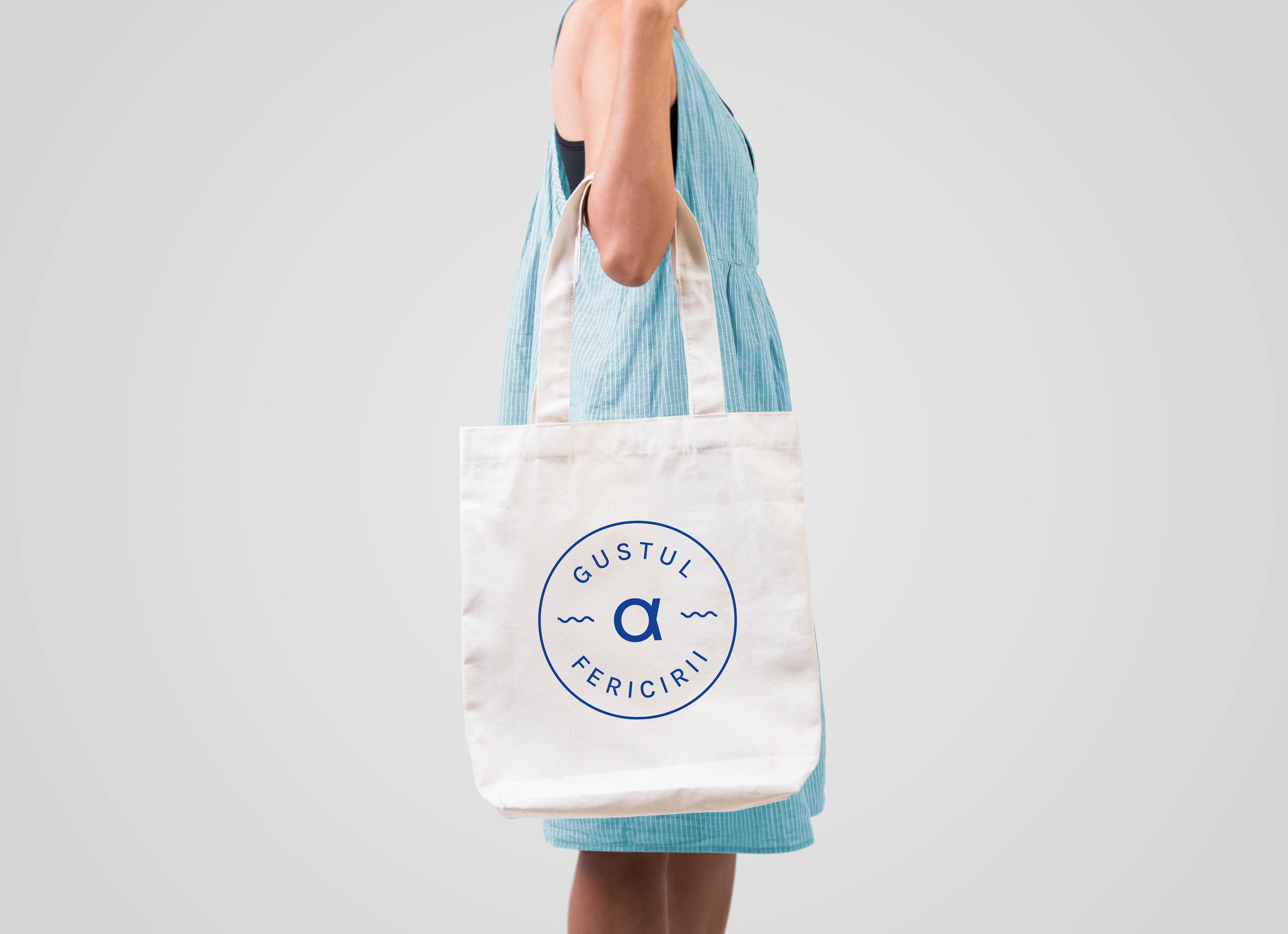
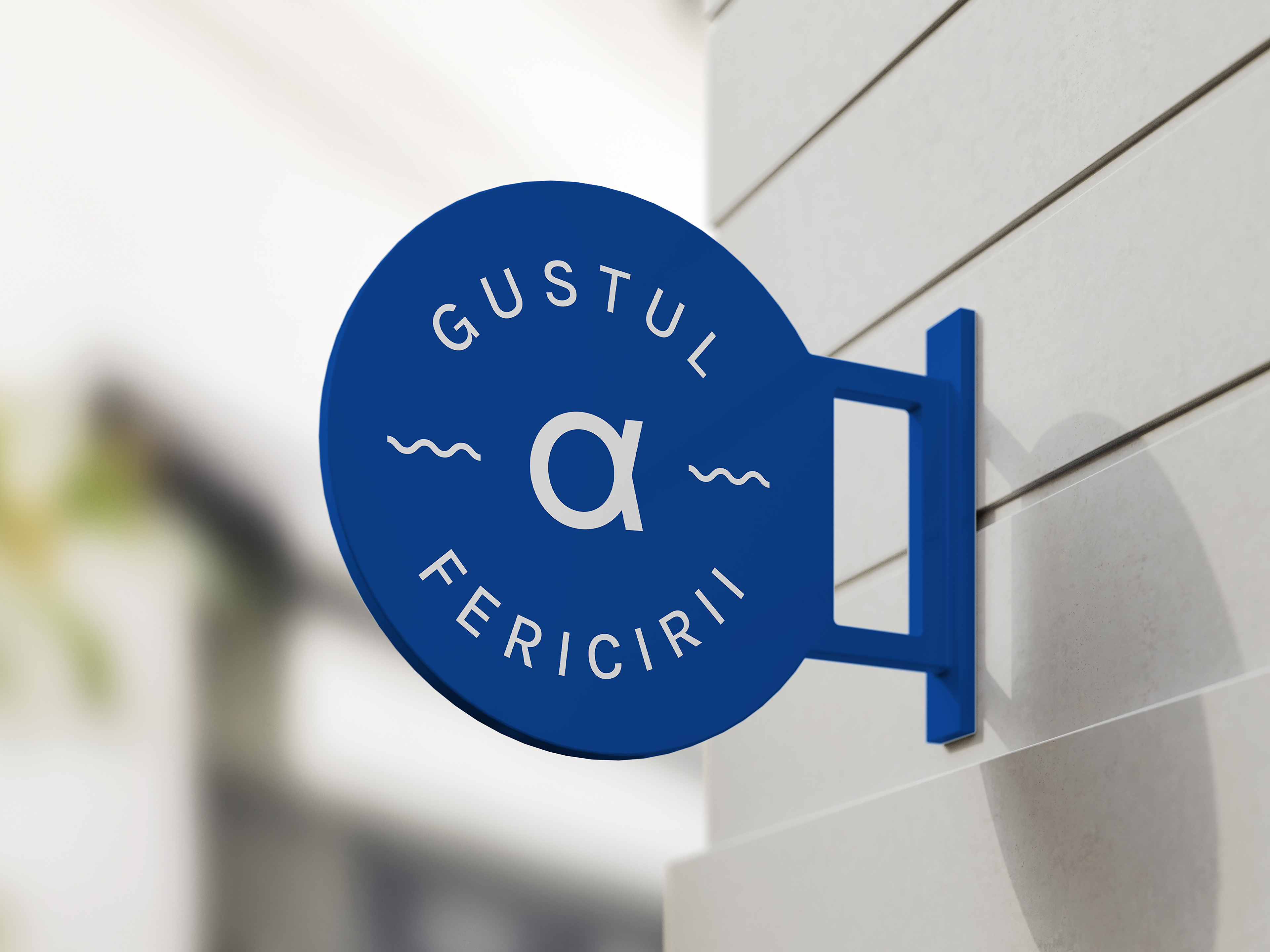
To reflect this idea, we created a minimal and elegant logotype, using Latin characters for clarity while replacing the letter “A” with the Greek Alpha (Α) — a subtle nod to the brand’s origins and meaning.
In Greek symbolism, Alpha represents both the beginning and leadership, echoing Arkadia’s position at the top of its field.
The color palette — white and mid-blue — evokes purity, freshness and the serene Mediterranean spirit.
OUTCOME
The result is a timeless and modern identity system that captures the essence of Greek charm, craftsmanship and joy.
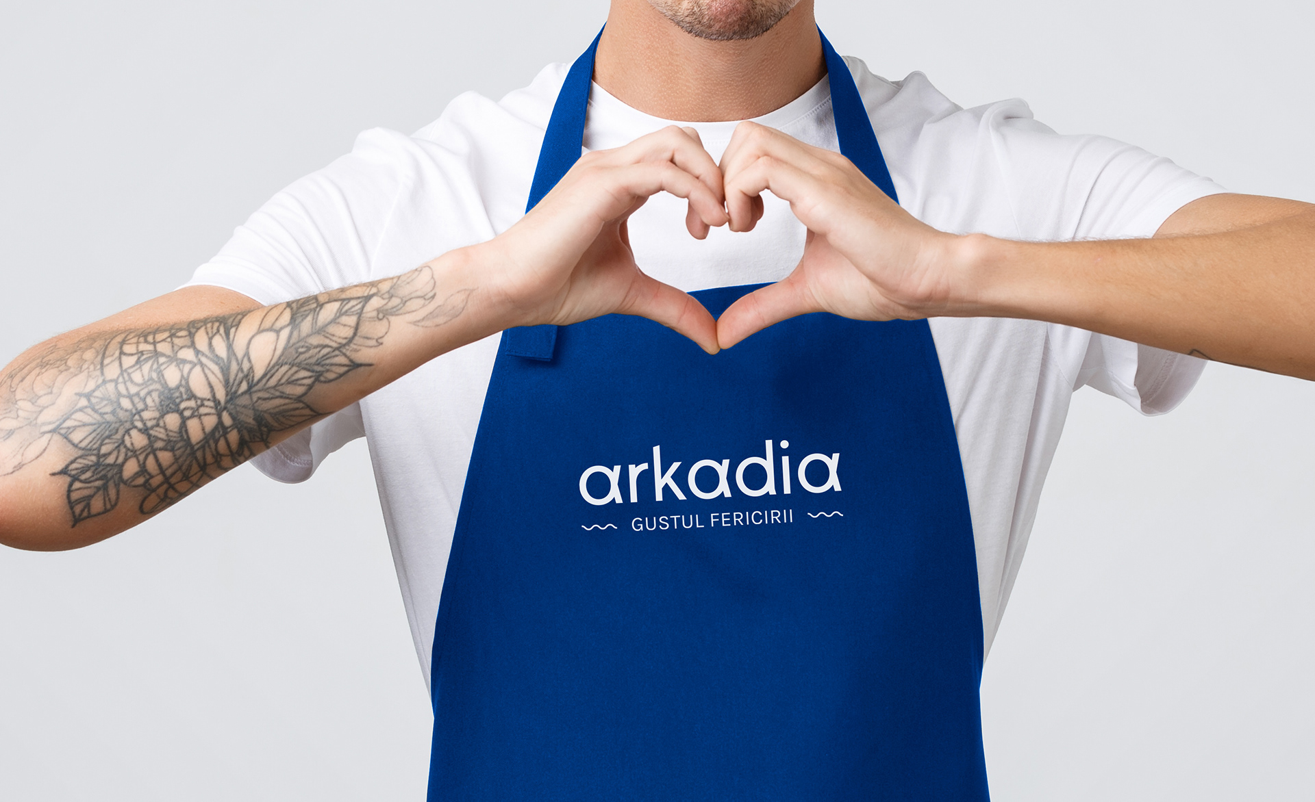
The slogan “The Taste of Happiness” perfectly conveys Arkadia’s promise — to bring delight and sweetness into everyday life.
The slogan “The Taste of Happiness” perfectly conveys Arkadia’s promise — to bring delight and sweetness into everyday life.


YEAR: 2023
CLIENT: Migdalo Cake SRL
LOCATION: Romania, Ramnicu Valcea, Slatina, Craiova
AWARD
Wolda 14th (Worldwide Logo Design Award) 2023 (AWARD OF EXCELLENCE)